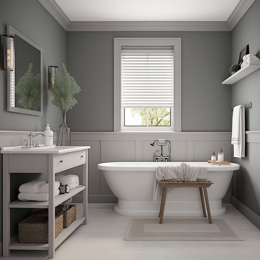
White, blue, beige, sage green, charcoal, and soft blush bath mats all work well with grey bathrooms.
For a typical U.S. bathroom, the best bath mat color depends on the shade of grey, the floor, the vanity, the lighting, and the other colors already in the room. Grey is a flexible neutral, so you do not have to match the mat exactly to the walls or tile.
If you want the safest choice, start with white or a soft neutral. For more color, muted blue and sage green create a calm look, while navy or charcoal gives stronger contrast. Beige, cream, and warm taupe are especially useful when your grey bathroom has wood, brass, or other warm finishes.
Source: Bing
The Best Bath Mat Colors for a Grey Bathroom
The most versatile bath mat colors for a grey bathroom are white, cream, blue, sage green, beige, charcoal, and selected warm accent colors. The right choice depends on whether you want the bathroom to look brighter, warmer, calmer, or more dramatic.
A bath mat is a relatively small part of the room, which makes it a useful way to introduce color without committing to a new wall color or replacing larger fixtures. Look at the bathroom as a complete palette rather than treating the grey walls or tile as the only color that matters.
Source: Bing
White
Creates crisp contrast and works particularly well with light or medium grey walls and white bathroom fixtures.
Cream and beige
Add warmth and can soften a grey bathroom that feels cool or stark.
Blue
Pairs naturally with cool grey and can create anything from a soft coastal look to a deeper, more dramatic scheme.
Sage green
Adds a muted natural color that works well with grey, wood tones, and other soft neutrals.
Charcoal
Builds a monochromatic grey palette while providing enough tonal difference to keep the mat from disappearing.
Blush or dusty pink
Adds a gentle warm accent to grey without the intensity of a bright red or orange.
White Is the Safest Classic Choice
A white bath mat is one of the easiest colors to pair with grey because most bathrooms already contain white elements such as a toilet, bathtub, sink, or trim. The repeated white color can make the room feel coordinated rather than overly matched.
White works especially well when the bathroom has light grey walls or flooring. In a darker grey bathroom, a white mat can provide a stronger visual break and help the floor area feel lighter.
Best for
Clean, bright, classic, and minimalist bathroom styles.
Watch for
White shows visible dirt, makeup, hair, and discoloration more readily than many medium or dark colors.
Blue Creates a Calm Grey-and-Blue Palette
Blue is a natural partner for many grey bathrooms, particularly when the grey has a cool blue undertone. Light blue can keep the room soft and airy, while navy creates stronger contrast and a more defined accent.
If the bathroom already has blue towels, shower curtains, artwork, or accessories, a blue bath mat can repeat that color at floor level and make the room feel more intentional.
Light blue
Best when you want a soft, relaxed appearance with relatively low contrast.
Navy
Best when you want a darker accent that stands out against light or medium grey.
Choose the Bath Mat Based on the Shade of Grey
Not every grey behaves the same way. Some greys lean blue, green, violet, or brown, while neutral greys sit closer to a true balance between warm and cool tones. Checking the undertone before choosing a bath mat can prevent a color combination that looks mismatched under your bathroom lighting.
You do not need to identify the exact paint color or tile color. Instead, compare the grey with a plain white item and look at it during the time of day when you normally use the bathroom. The apparent undertone can change under daylight and artificial lighting.
Source: Bing
Light cool grey
Try white, pale blue, navy, soft sage, or another cool-to-neutral accent.
Medium neutral grey
Most of the recommended colors work, so choose based on the mood and contrast you want.
Warm grey or greige
Cream, beige, taupe, muted green, and warm natural shades can reinforce the room’s warmth.
Dark charcoal grey
White, cream, pale blue, muted green, or a lighter grey can prevent the floor from becoming visually heavy.
Why Undertones Matter
Two surfaces can both be described as grey but still look very different beside the same bath mat. A cool grey can make a warm beige look more noticeable, while a warm grey may make a blue mat appear cooler by comparison.
The easiest approach is to repeat a color that already appears elsewhere in the bathroom. If the vanity has warm wood, for example, a cream or beige mat may connect more naturally with the room than an icy blue.
Use existing colors first
Look at towels, shower curtains, artwork, vanity finishes, flooring, and accessories before adding a new accent color.
Test before buying
Place a fabric sample or similar-colored towel on the bathroom floor to see how the color looks against the grey.
Best Bath Mat Colors by the Look You Want
The best color is also the one that produces the mood you want. A grey bathroom can look crisp and modern, warm and inviting, natural and relaxed, or dramatic depending on the bath mat and the other textiles used around it.
Use the table below as a starting point rather than a strict rule. The same mat color can look very different depending on the shade of grey, flooring, natural light, and surrounding finishes.
Source: Bing
For a bright bathroom
Choose white, ivory, or a very pale blue.
For a warm bathroom
Choose cream, beige, taupe, or muted earthy tones.
For a spa-like bathroom
Choose sage green, soft blue, or a restrained neutral.
For a modern bathroom
Choose charcoal, white, black, navy, or a simple grey pattern.
For a softer decorative look
Choose dusty pink, muted mauve, sage, or another subdued accent.
Color Comparison at a Glance
If you are deciding between several colors, start with the level of contrast you want. Light neutrals generally blend gently with grey, while navy, charcoal, and deeper accent colors create a more noticeable floor-level focal point.
Lowest contrast
Light grey, cream, ivory, and soft beige.
Moderate contrast
Sage green, muted blue, dusty pink, and medium grey.
High contrast
Navy, charcoal, black, or saturated accent colors.
What Color Bath Mat Goes With a Grey and White Bathroom?
For a grey and white bathroom, you can safely use white, light grey, blue, sage green, beige, or charcoal. White creates the most seamless look, while blue or green adds color without fighting the existing neutral palette.
If the bathroom already contains plenty of white, a colored mat can provide useful visual balance. If the room has patterned tile or several decorative elements, a solid neutral mat may be the better choice because it gives the eye a quieter area.
Source: Bing
Grey and white with blue
Creates a fresh, calm palette and works especially well with cool grey.
Grey and white with sage
Adds a natural accent and pairs well with wood or plant-inspired decor.
Grey and white with cream
Softens the contrast and creates a warmer transitional appearance.
Grey and white with charcoal
Creates a stronger modern contrast while staying within a neutral palette.
When a Patterned Mat Makes Sense
A patterned bath mat can work well when the rest of the bathroom is relatively simple. A grey-and-white geometric pattern, for example, can connect several neutral surfaces without introducing a completely new color.
Keep the pattern simpler when the room already has patterned tile, a decorative shower curtain, or heavily veined stone. Too many competing patterns can make a small bathroom feel visually crowded.
Simple room
A stronger pattern or accent color can provide useful visual interest.
Busy room
A solid mat or subtle texture usually keeps the overall palette calmer.
Should a Bath Mat Match the Bathroom Floor or the Walls?
A bath mat does not need to match either the floor or the walls exactly. It usually looks more coordinated when its color relates to at least one existing element in the room, such as the towels, vanity, shower curtain, artwork, tile accent, or metal finish.
If the floor is already a strong color or pattern, choosing a mat that echoes a quieter color from the floor can create cohesion. If both the floor and walls are plain grey, the mat is an easy place to introduce contrast.
Source: Bing
Grey floor
Try white, cream, blue, green, or a different grey value so the mat remains visible.
White floor
A grey, blue, green, beige, or patterned mat can establish a stronger focal point.
Wood-look floor
Warm neutrals, sage, cream, or muted colors can connect the wood with the grey.
Patterned floor
A solid mat pulled from one of the floor’s existing colors usually creates a cleaner result.
Think in Terms of Repetition
Color repetition is often more useful than exact matching. For example, if your grey bathroom has navy towels, a navy bath mat can repeat that accent near the floor. If the vanity is natural wood and the towels are cream, a beige or cream mat can tie those elements together.
Repeat one accent
Use the bath mat to repeat a color that already appears elsewhere rather than introducing several unrelated colors.
Allow contrast
A mat that is slightly lighter or darker than nearby surfaces can add depth without looking mismatched.
How to Choose the Right Color for a Small Grey Bathroom
In a small grey bathroom, a lighter bath mat can help maintain a more open visual feel, especially when the room has limited natural light. White, ivory, pale beige, and soft blue are straightforward choices.
A dark bath mat is not automatically wrong in a small bathroom. It can provide useful contrast, but it becomes a stronger visual feature. If you choose charcoal or navy, repeating that darker shade in a towel, frame, hardware, or another small accessory can make the choice look deliberate.
Source: Bing
Limited natural light
Consider light neutrals or soft colors that do not add another large dark area.
Lots of white fixtures
A white or cream mat can reinforce the existing brightness.
Minimalist design
Use a simple solid mat in white, grey, beige, or charcoal.
Need more personality
Use muted blue, sage, dusty pink, or another restrained accent.
Do Not Ignore Bathroom Lighting
Artificial bathroom lighting can change how a mat color appears. Cool lighting can make blue and blue-grey shades look more pronounced, while warmer lighting can make beige, cream, and taupe appear richer.
Before buying, compare the color in the actual bathroom rather than relying only on a product photo viewed on a phone or computer. This is especially useful when the mat color is close to the grey of the walls or floor.
Daylight
Shows the color under natural conditions and can reveal whether a grey leans cool or warm.
Bathroom LEDs
Can shift the appearance of both grey surfaces and colored textiles, so check the combination under your usual lighting.
Common Bath Mat Color Mistakes in Grey Bathrooms
The biggest mistake is choosing a color in isolation. A bath mat that looks attractive online may not work as well once it is placed beside your particular grey tile, flooring, vanity, and lighting.
You also do not need to make every textile the same color. Coordinating a few related shades usually gives the room more depth than buying a matching set in one color.
Source: Bing
Matching the grey too closely
A nearly identical grey can disappear against the floor. A small difference in value or texture can help the mat remain visible.
Adding too many accent colors
Grey can support many colors, but using several unrelated accents can make the room feel disjointed.
Ignoring warm and cool relationships
A warm beige or cool blue may look very different beside your particular grey, so compare samples in the room.
Choosing only for appearance
A beautiful color does not compensate for a mat that is poorly suited to the bathroom’s use, cleaning routine, or placement.
Overusing dark colors
Multiple dark textiles can make a small bathroom feel visually heavier, particularly when the room already has charcoal tile or cabinetry.
Color Is Only One Part of the Decision
Once you have narrowed down the color, consider the mat’s size, shape, texture, absorbency, cleaning requirements, and ability to stay stable on the bathroom floor. These practical factors can matter more than whether the color is the exact shade you originally imagined.
For households with frequent bathroom use, a color that is easy to keep looking clean may be more practical than a very light shade. The best choice balances appearance with the way the bathroom is actually used.
High-use bathroom
A medium shade or patterned design can be more forgiving of everyday marks than pristine white.
Guest bathroom
A lighter or more decorative color may be easier to prioritize when daily wear is lower.
Frequently Asked Questions
Q
What is the safest bath mat color for a grey bathroom?
White, cream, and light beige are among the safest choices because they work with many shades of grey and coordinate easily with common white bathroom fixtures. Choose white for a crisp look or cream and beige when you want more warmth.
Q
Does blue go with a grey bathroom?
Yes. Blue is especially effective with cool grey. Light blue creates a soft, relaxed combination, while navy gives a stronger contrast. If blue already appears in your towels or accessories, repeating it in the bath mat can make the room feel more coordinated.
Q
Does beige go with grey in a bathroom?
Yes. Beige and cream can soften a grey bathroom and are particularly useful when the room includes warm wood, brass, bronze, or other warm finishes. They can also help a cool grey space feel less stark.
Q
Should the bath mat be the same color as the towels?
No. The bath mat and towels can match, but they do not have to. Repeating one color while using a related shade for the other textile can create a coordinated look with more visual depth.
Q
What color bath mat works with dark grey walls?
White, cream, pale blue, sage green, and lighter grey can provide useful contrast against dark grey walls. Charcoal can also work for a monochromatic look, but it may blend into the room if the flooring and other surfaces are already very dark.
✦ Wrapping Up
Conclusion
The best bath mat color for a grey bathroom is the one that supports the room’s existing palette and the mood you want to create. White and cream are easy, flexible choices; blue and sage green add calm color; beige and taupe bring warmth; and charcoal creates a deeper monochromatic look.
Before choosing, check the grey’s undertone, the floor color, bathroom lighting, towels, vanity, and metal finishes. A bath mat does not need to match one surface exactly. Repeating an existing accent color or adding a controlled contrast usually produces a more balanced result.
💡 Key Takeaway
For the easiest decision, choose white or cream for a clean neutral look, muted blue or sage for color, or charcoal for a darker modern palette, then compare the mat in your actual bathroom lighting before buying.
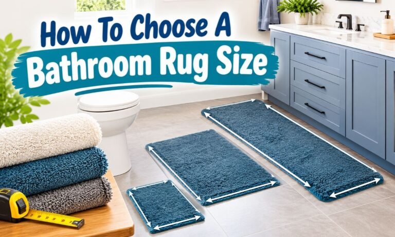
Learn what size bathroom rug works best for a double vanity, including runner sizes, two-rug layouts, measuring tips, clearances, and placement examples.
Learn how thick a bath mat should be for comfort, absorbency, drying, door clearance, and bathroom safety, with practical thickness ranges for different needs.